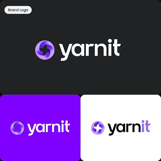
The Yarnit that you knew and loved has now gotten even better. We are now redefining the AI content creation experience with a completely revamped design language. This transformation is not just cosmetic; it's a fundamental shift in how creators engage with the platform. The rebranding of Yarnit infuses new energy into the brand, bringing a fresh perspective on integrating technology with creativity.
Our redesign isn't just about aesthetics; it's about creating a more cohesive, efficient, and human-centered user experience. We've retained the core elements that our users love but have fine-tuned them to reflect the growth and maturity of Yarnit.
In this blog, we will dive into the various components of Yarnit's new design language, exploring how each element contributes to a more integrated and balanced user experience. From our keystone logoform to our updated color palette and dual font styles, we'll uncover the thought process behind each design choice.
Our New Logoform and Logotype

At the heart of Yarnit's new visual identity is our logoform, a vital element that anchors our brand's essence. Our logoform uses the concept of 'context' through the integration of quote marks, symbolizing continuous conversation and dynamic interaction. The quote marks create a sense of dialogue, mirroring how our platform enables users to engage in meaningful conversations through their content.
Moreover, the "integration" aspect of our logoform illustrates how different shapes come together to form a cohesive whole. This metaphorically amplifies Yarnit's mission to provide a unified platform where various content creation tools work in harmony. The seamless blending of shapes signifies our dedication to integrating technology and human creativity, offering a balanced approach to storytelling.
While we have introduced several new elements into our design language, we've retained a touch of the familiar through our logotype. It's essential to honor the past while embracing the future, and our updated logotype reflects this philosophy.
The redesigned pinwheel from our old logo is a symbol of Yarnit's core function. Just as a pinwheel spins effortlessly in the wind, Yarnit seamlessly weaves together diverse strands of information to create a cohesive narrative. This dynamic process mirrors the art of "spinning a yarn"- crafting compelling stories that captivate and engage. With Yarnit, your brand's unique story is always in motion, continuously adapting and evolving to create content that resonates deeply with your audience.
We have kept the core structure of our original brand logo but have refined it to signify the evolution and growth that Yarnit has undergone. The improved logotype seamlessly integrates with our new design language, ensuring that every element of our brand identity works in harmony.
Duality in Colors and Font

Yarnit's new color palette employs a considered two-tone approach, blending purple and lime green to strike a balance between creative reflection and fresh innovation. Purple has long been associated with creativity and introspection. On the other hand, lime green introduces a burst of freshness and vitality.
This combination of colors communicates a balanced approach between thoughtful creativity and dynamic execution. The added nuances of purple and lime soften the brand's overall tone, making it more approachable and humane. Our signature gradients further enhance this visual communication, serving as a shorthand for contextualized intelligence.
These colors are not just confined to the decorative elements; they permeate every aspect of the UI, allowing the content to shine while creating a cohesive and immersive environment.

As part of the New Yarnit, we've embraced dual font styles to embody the concept of balance and duality. Poppins is our primary font, used for branded creatives and any client-facing communications. With its rounded and geometric structure, Poppins renders our messaging in a confidently bold voice, striking a perfect balance between modernity and approachability.
Complementing Poppins is Inter, the functional component of our typography. Inter is used within the UI to aid readability and user navigation without distracting them with an imposing sense of personality. It provides clarity and precision, ensuring users can focus on their tasks without any hindrance.
By combining Poppins and Inter, we achieve a typographic harmony that reflects our core values of creativity, innovation, and practicality. This dual approach ensures that every piece of text, whether it's a headline or a body paragraph, is optimized for maximum impact and readability.
Other Elements: Integrating Quotes and Grids
In addition to our new logoform, color palette, and typography, Yarnit's redesign incorporates other essential elements that enhance our brand identity. One of these is the use of the quote shape, a foundational piece of our brand identity. This element serves as a framing tool, positioning content in a contextually meaningful way. By integrating the quote shape throughout the platform, we create a visual metaphor for the conversations and narratives that our users craft.
Another vital component is the grid system we've integrated into our design language. The grid provides a structured approach to content generation, allowing for flexibility without being overly restrictive. While the grid offers structure, it does not limit creativity; instead, it provides a dependable framework within which users can freely express their ideas.
Yarnit's new design language marks a significant milestone in our journey towards redefining content creation. Every element has been thoughtfully selected to create a cohesive, user-centered experience. Our redesign showcases the evolution of Yarnit, honoring our roots while looking ahead to the future.
We invite you to explore the new Yarnit and discover how our reimagined design can enhance your content creation process. Sign up for our upcoming webinar to get an in-depth look at the new features and see how Yarnit continues to revolutionize the world of storytelling.


